CSS
Cool Tools
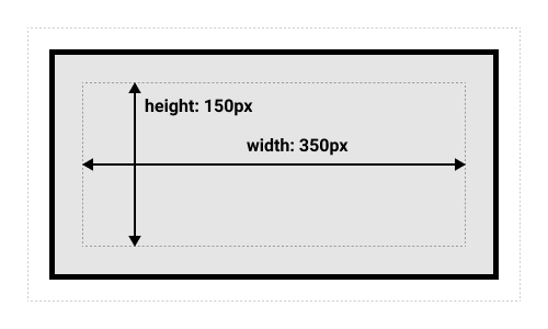
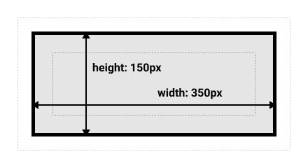
Box Model
Margin collapses between elements.
Standard Box Model
Alternate Box Model
html {
  box-sizing: border-box;
}
*, *::before, *::after {
  box-sizing: inherit;
}
Note: The margin is not counted towards the actual size of the box — sure, it affects the total space that the box will take up on the page, but only the space outside the box. The box's area stops at the border — it does not extend into the margin.
Flex Box
Centered on X and Y axis justify-content: center is the X axis align-items: center is the Y axis if the flex-direction is default flex-direction: row
.box {
  display: flex;
  align-items: center;
  justify-content: center;
}

.box div {
  width: 50px;
  height: 50px;
}
<div class="box">
  <div></div>
</div>
CSS Colors
3 Digit Hex Code: The 3-digit hex code can only be used when both the values (RR, GG, and BB) are the same for each components. So, if we have #ff00cc (Private), it can be written like this: #f0c (Private).
Margins
Margin Auto
Margin auto will center an element in the middle of the page.
Margin Collapse
Only happens in top or bottom margins, if two consecutive elements have top or bottom margins they are not additive but the greater of the two will be displayed.
Lists
ul {
  /* To replace list marker with image */
  list-style-image: url('sqpurple.gif');
  /* To place list marker outside the list item, outside is default */
  list-style-position: inside;

}
Tables
Removing double borders on tables:
table {
  border-collapse: collapse;
}
Responsive Table: place the table in an element with overflow-x: auto
<div style="overflow-x:auto;">

<table>
... table content ...
</table>

</div>
Z-Index
z-index only works on positioned elements (position: absolute, position: relative, position: fixed, or position: sticky) and flex items (elements that are direct children of display: flex elements).
If two positioned elements overlap each other without a z-index specified, the element defined last in the HTML code will be shown on top.
Clear-Fix Hack
If a floated element is taller than the containing element, it will "overflow" outside of its container.
.clearfix::after {
  content: "";
  clear: both;
  display: table;
}
Inline-Block
-
Compared to
display: inline, the major difference is thatdisplay: inline-blockallows to set a width and height on the element. -
Also, with
display: inline-block, the top and bottom margins/paddings are respected, but withdisplay: inlinethey are not. -
Compared to
display: block, the major difference is thatdisplay: inline-blockdoes not add a line-break after the element, so the element can sit next to other elements.
display: inline
display: inline-block
display: block
Centering Elements
Center Align Element: To horizontally center a block element (like <div>), use margin: auto; Note: Center aligning has no effect if the width property is not set (or set to 100%).
Center Align Text: To just center the text inside an element, use text-align: center;
Center An Image: To center an image, set left and right margin to auto and make it into a block element:
Center Vertically:
- Use bottom and top padding.
-You can also use line-height with a value equal to the height property of the element.
-
If padding and line-height are not options, another solution is to use positioning and the transform property:
transform: translate(-50%, -50%); -
You can also use flexbox to center things. Just note that flexbox is not supported in IE10 and earlier versions:
.center {
  display: flex;
  justify-content: center;
  align-items: center;
  height: 200px;
  border: 3px solid green;
}
CSS Combinators
Descendant Selector
div p {
  background-color: yellow;
}
Selects all P elements inside a div.
Child Selector (>)
div > p {
  background-color: yellow;
}
Selects all direct child P elements inside a div.
Adjacent Sibling Selector (+)
The adjacent sibling selector is used to select an element that is directly after another specific element.
div + p {
  background-color: yellow;
}
Selects the first <p> element that are placed immediately after <div> elements
General Sibling Selector
The general sibling selector selects all elements that are next siblings of a specified element.
div ~ p {
  background-color: yellow;
}
Selects all <p> elements that are next siblings of <div> elements:
Pseudo Classes
A pseudo-class is used to define a special state of an element.
Note: a:hover MUST come after a:link and a:visited in the CSS definition in order to be effective! a:active MUST come after a:hover in the CSS definition in order to be effective!
Pseudo-class names are not case-sensitive.
:first-child
:lang(es) usage <q lang="es">
| Selector | Example | Example description |
|---|---|---|
| :active | a:active | Selects the active link |
| :checked | input:checked | Selects every checked <input> element |
| :disabled | input:disabled | Selects every disabled <input> element |
| :empty | p:empty | Selects every <p> element that has no children |
| :enabled | input:enabled | Selects every enabled <input> element |
| :first-child | p:first-child | Selects every <p> elements that is the first child of its parent |
| :first-of-type | p:first-of-type | Selects every <p> element that is the first <p> element of its parent |
| :focus | input:focus | Selects the <input> element that has focus |
| :hover | a:hover | Selects links on mouse over |
| :in-range | input:in-range | Selects <input> elements with a value within a specified range |
| :invalid | input:invalid | Selects all <input> elements with an invalid value |
| :lang(language) | p:lang(it) | Selects every <p> element with a lang attribute value starting with "it" |
| :last-child | p:last-child | Selects every <p> elements that is the last child of its parent |
| :last-of-type | p:last-of-type | Selects every <p> element that is the last <p> element of its parent |
| :link | a:link | Selects all unvisited links |
| :not(selector) | :not(p) | Selects every element that is not a <p> element |
| :nth-child(n) | p:nth-child(2) | Selects every <p> element that is the second child of its parent |
| :nth-last-child(n) | p:nth-last-child(2) | Selects every <p> element that is the second child of its parent, counting from the last child |
| :nth-last-of-type(n) | p:nth-last-of-type(2) | Selects every <p> element that is the second <p> element of its parent, counting from the last child |
| :nth-of-type(n) | p:nth-of-type(2) | Selects every <p> element that is the second <p> element of its parent |
| :only-of-type | p:only-of-type | Selects every <p> element that is the only <p> element of its parent |
| :only-child | p:only-child | Selects every <p> element that is the only child of its parent |
| :optional | input:optional | Selects <input> elements with no "required" attribute |
| :out-of-range | input:out-of-range | Selects <input> elements with a value outside a specified range |
| :read-only | input:read-only | Selects <input> elements with a "readonly" attribute specified |
| :read-write | input:read-write | Selects <input> elements with no "readonly" attribute |
| :required | input:required | Selects <input> elements with a "required" attribute specified |
| :root | root | Selects the document's root element |
| :target | #news:target | Selects the current active #news element (clicked on a URL containing that anchor name) |
| :valid | input:valid | Selects all <input> elements with a valid value |
| :visited | a:visited | Selects all visited links |
Resizing Text
You can use calc() to create a resizing rule that keeps a baseline size but allows you to enlarge as the viewport increases.
body {
  // font grows 1px for every 100px of viewport width
  font-size: calc(16px + 1vw);
  // leading grows along with font,
  // with an additional 0.1em + 0.5px per 100px of the viewport
  line-height: calc(1.1em + 0.5vw);
}
Fluid Aspect Ratios
/* full-width * aspect-ratio */
.full-width {
  width: 100vw;
  height: calc(100vw * (9/16));
}
CSS Truncate
Allows you to truncate a line of text. CSS Tricks Page
.truncate {
  width: 250px;
  white-space: nowrap;
  overflow: hidden;
  text-overflow: ellipsis;
}
Opacity
If you dont want to apply opacity to child elements you can use RGBA colors instead of the opacity css property.
Children